Different maps
If you bike from Tilburg city center to the university you will find, on the side of the bike path, unmistakable signs that … spring is coming! If this is your first year of spring in Tilburg, each tree in blossom will probably be a little surprise for you! If, instead, you have been around for a few blossom seasons, as I have, you probably already have your own favorite spot and you can’t wait to see it bloom again!
This post is about maps and about same places, in different times.
‘Different maps’
I have never been very good at geography, though I am fond of maps. Naming capitals and rivers, drawing borders, guessing the name of a country from its shape are all activities that give me a hard time. So, how could I explain my love for maps?
Maybe not all forms of attraction need an explanation. However, I think I could name at least one good reason that shows why being a lover of maps is not in flat contradiction with being allergic to geography.
The reason is that I do not see maps just as representations of lands and space. What I love about maps is the way in which they try to put on paper what we know about the world around us. Last week, some American newspapers refueled the old discussion that one of the portraits of the world, to which most of us are used to, the Mercator projection, is full of inaccuracies. It puts Europe in the center and it makes Africa and South America seem smaller than North America and Europe.
So, Mercator projection is more a distortion than a portrait. But I do not feel very surprised about this news, nor do I think that the misrepresentation is a sort of betrayal. After all, the old cartographer was quite honest in naming his work back in 1569: he called his world map ‘Nova et Aucta Orbis Terrae Descriptio ad Usum Navigantium Emendata’, which means ‘New and Augmented Description of Earth corrected … for the use of sailors’.
As the name of Mercator’s map tells us, maps are not simply representations ‘of’ something. Maps are above all representations meant to work ‘for’ someone, and ‘for’ some purpose. Before going to school, the maps I was familiar with were the ones sketched with inexperienced hands, and on the basis of imaginative eyes, by myself and by the other children of the neighborhood. In those rudimentary maps, we drew special signs for spots where to meet and play; special signs for gardens that hosted dogs and cats that we could visit; special signs for annoying old neighbors that we wanted to avoid.
You can bet that the place where we lived was, for any adult, hard to recognize in the inaccurate products of this childish cartography. But for us, ‘the children of the neighborhood’, those maps did their job: they allowed us to orient ourselves, while we were discovering the space around us together.
For me, then, drawing a map is an undertaking very similar to tidying up my bookshelves or my wardrobe. That’s because what all these three processes have in common is that they require two steps. First, observing what’s out there. Then, sorting things according to criteria that I find useful to retrace a place, a book, a shirt every time I want to find these things again in the future!
Last week was the first day of spring and, for me, that was a good occasion to have a look at one of my ‘personal’ maps: the map of my favorite blooming spots in Tilburg.
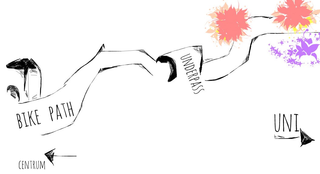
Looking back at this map I realized that I need to update it: the cafe on the left corner now has a different name. But, luckily, the magnificent magnolia trees are still there to welcome bikers who climb the little hill coming out of the underpass.
I’ve seen so many students taking pictures of those trees in the past springs. Many of these students will no longer need this map this year: they have already moved somewhere else and, maybe, they are now taking new pictures of unknown trees in blossom. After all, whatever map we draw we cannot really leave out the passing of time…
Take, for example, the map of the European Union. The EU celebrated its 60th birthday on March 25th and lots of things could be said about its 60 years of history, in terms of blurring and re-drawing borders. As it may be clear at this point of my discussion about mapping, I have quite a strong preference for personal maps over official maps. That is why I wanted to celebrate the EU’s birthday; I decided to draw my personal map of it.
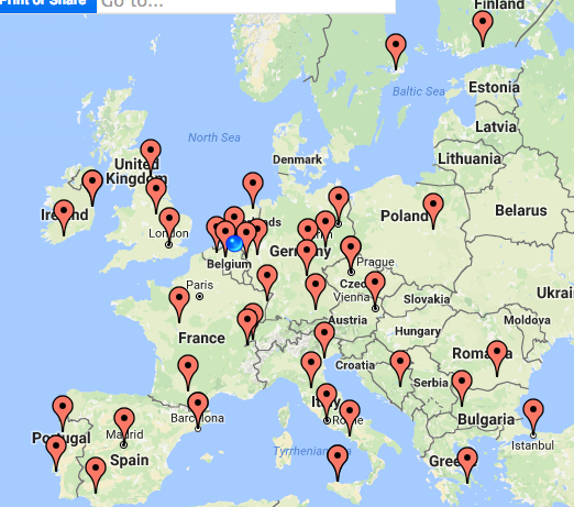
Each red spot in this map signals a place that is particularly ‘close’ to me: a place where a dear friend lives, or a place of which I’ve drawn a personal map in my memories.
In this representation, it looks like the EU has got the chicken pox.
And what does your personal map of EU look like?
Advertentie.


